01 Overview
From fragmented to unified
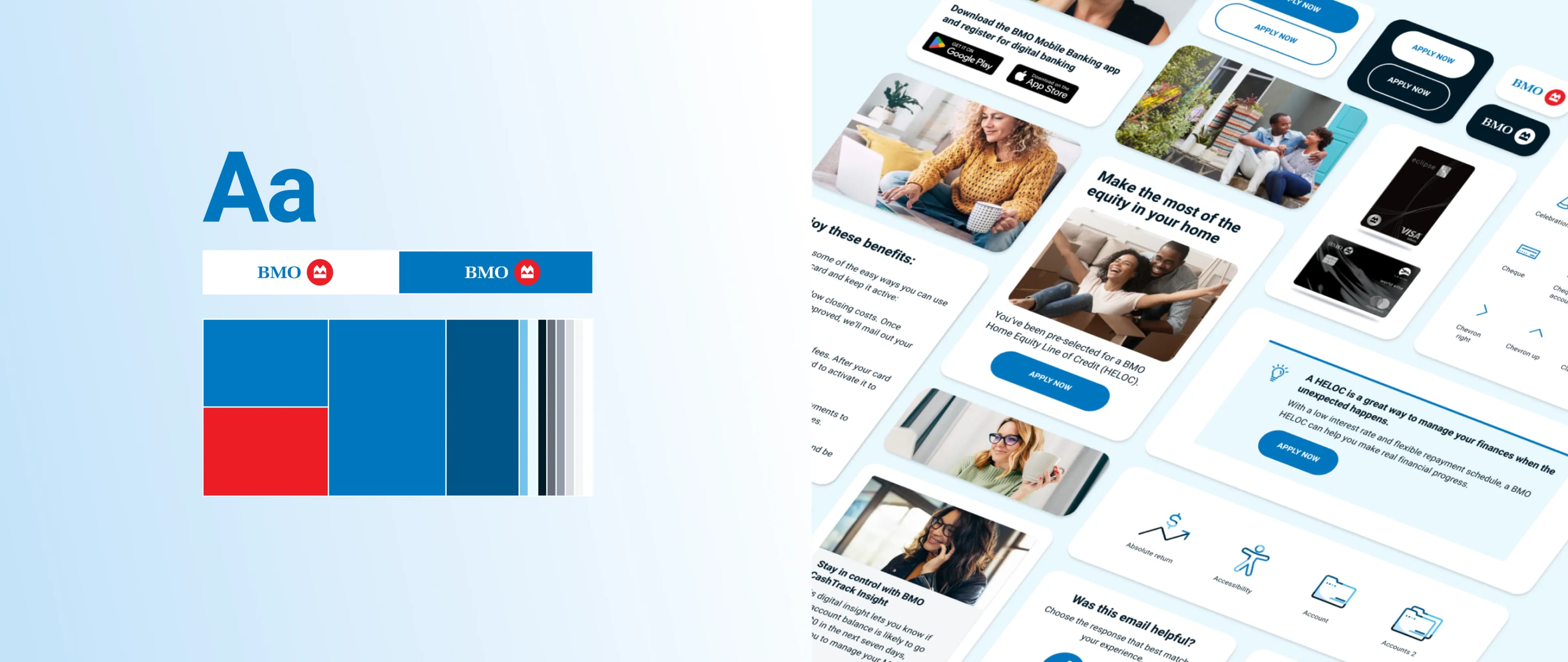
BMO's Digital Communications Centre of Excellence sends over 125 million customer emails annually. The existing process was fragmented, with no shared system, no visual consistency, and teams building from scratch every time. This project was about fixing that at the root. A modular design system was built from the ground up to streamline production, align with brand standards, and improve the experience for every subscriber on the receiving end.
02 Design Strategy
A focused strategy, three pillars
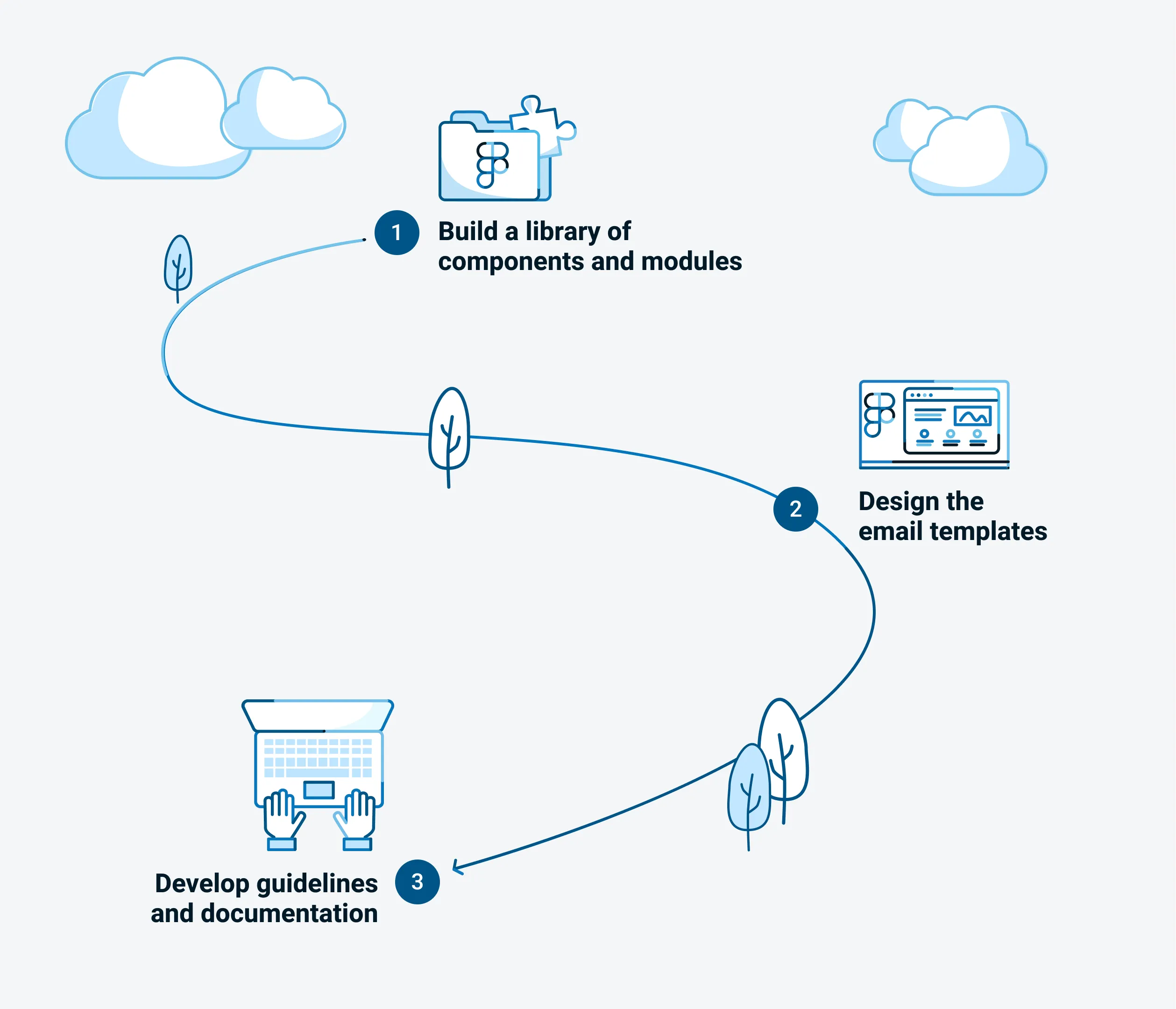
The strategy was built around three pillars. First, a reusable component and module library to eliminate redundancy and maintain consistency across campaigns. Second, accessible, mobile first, and dark mode optimised templates grounded in real user behaviour. Third, clear documentation so designers, developers, and marketing teams could adopt the system with confidence and move fast without breaking things.
03 Process
Built through collaboration
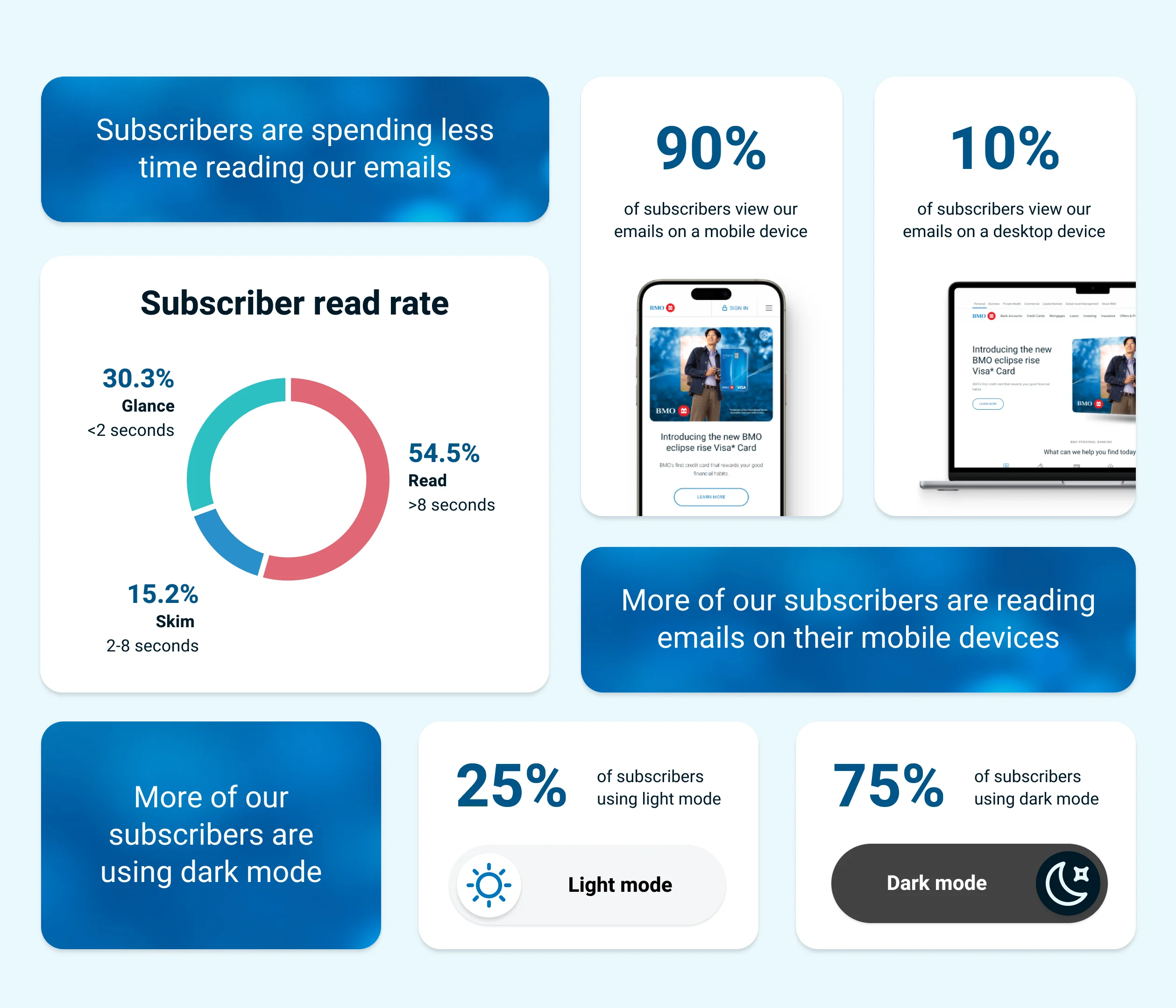
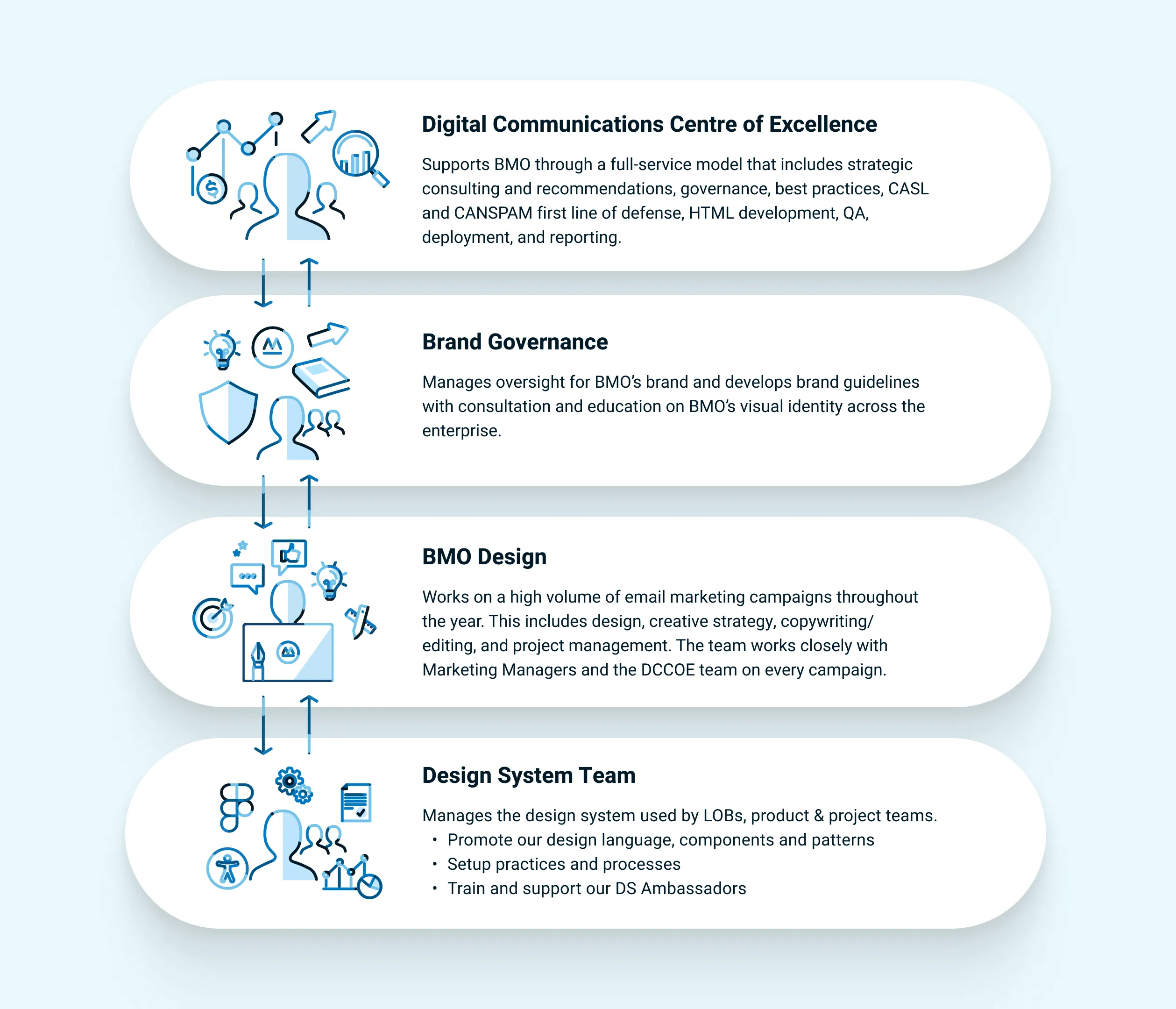
Cross-functional collaboration was central to how this system came together. Engagement data shaped decisions around accessibility, mobile responsiveness, and dark mode support. Developer partnerships ensured components would render reliably across email clients. Alignment with BMO's Brand Governance and Design System teams kept everything on brand and compliant. The result was a solution that was technically sound, visually consistent, and built for long-term adoption.
04 Challenges with the Old Design
Understanding what was broken
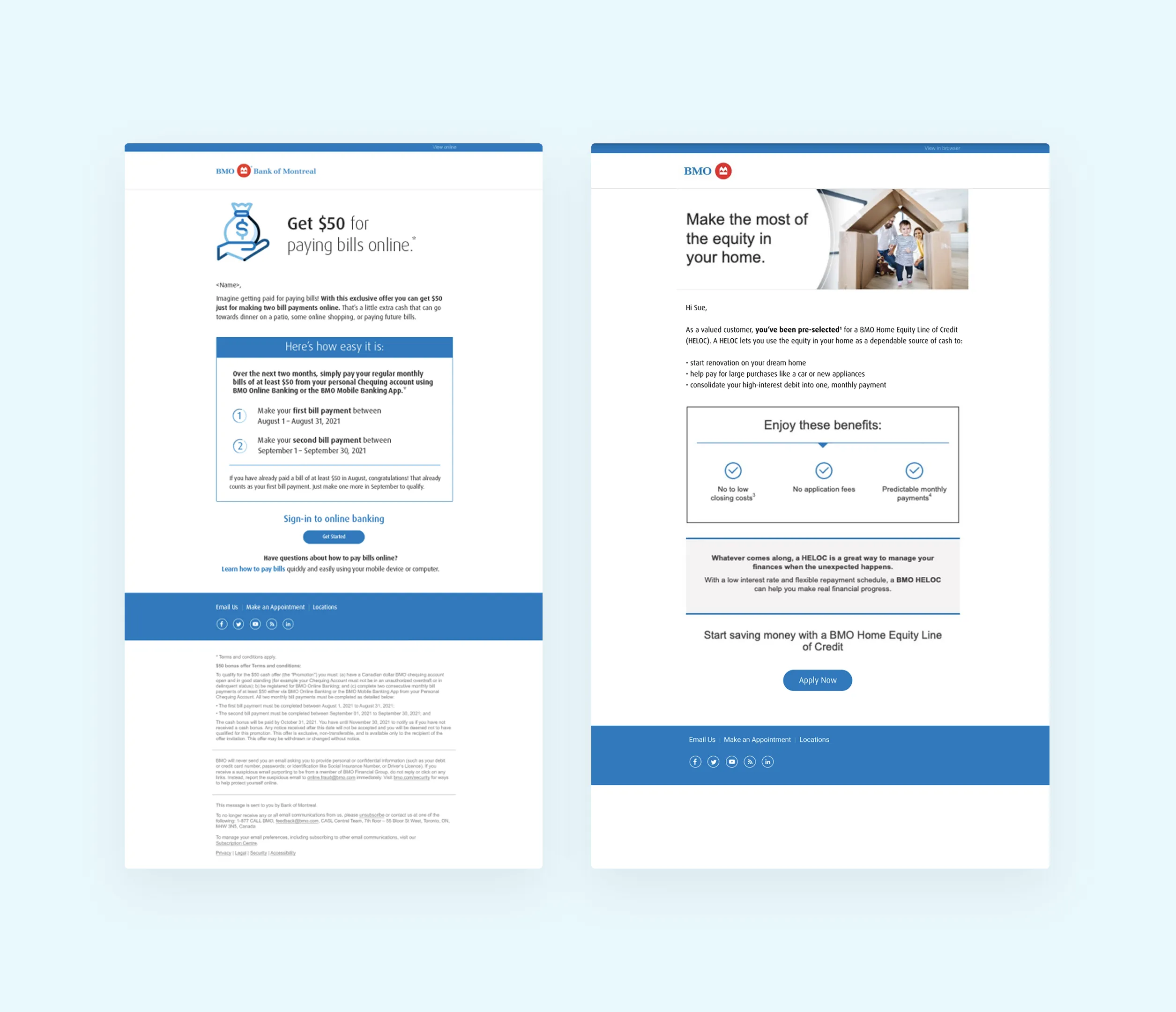
Before anything could be built, the existing state needed to be understood. Emails varied wildly in layout, imagery, and styling with no shared guidelines to hold things together. Teams were building from scratch in silos, making it impossible to move quickly or reuse past work. CTAs were buried too low despite 30% of users spending under two seconds on an email. These pain points became the brief.
05 Building the Design System
Atomic design, applied
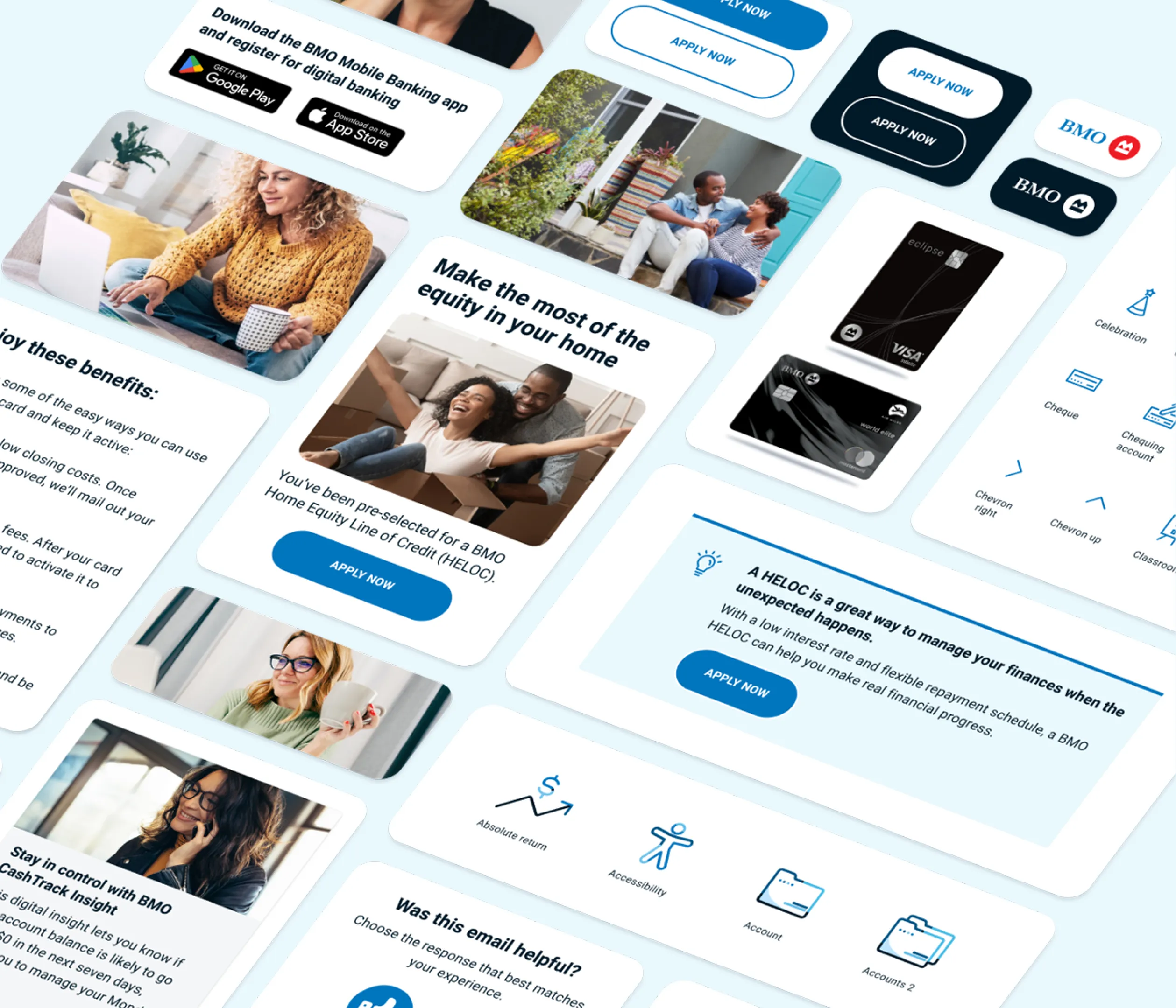
The system was grounded in atomic design principles, starting with foundational components and scaling up to full templates. The component library included buttons, client cards, icons, illustrations, logos, and hero images, each crafted to meet accessibility standards and render reliably across email clients. These were then assembled into purpose-driven modules including article blocks, hero sections, headers, footers, and responsive tables, flexible enough to support a wide range of campaign needs without sacrificing consistency.
06 Email Templates
Four templates, every use case
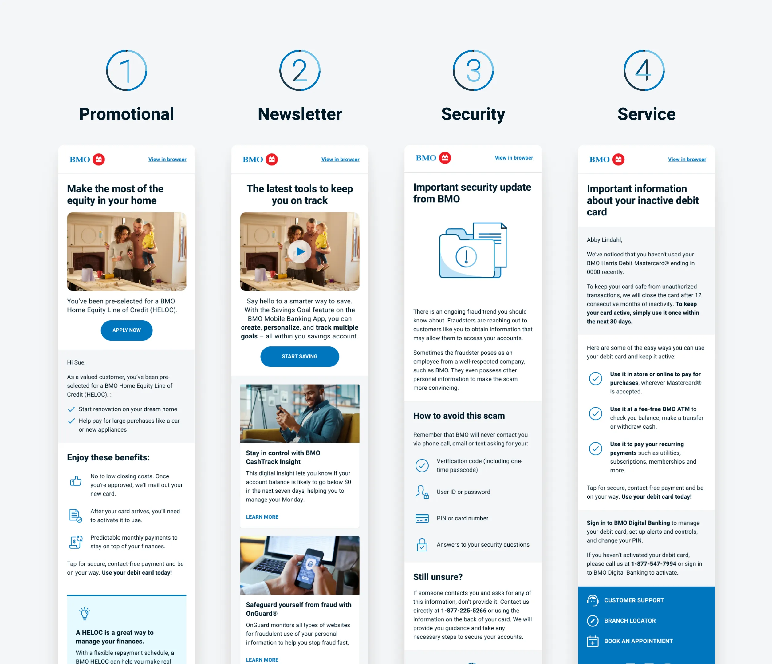
Four core templates were built to cover BMO's most frequent email types. Promotional for time-sensitive campaigns, Newsletter for skimmable financial content, Security for urgent fraud and scam alerts, and Service for essential updates like policy changes. Each template was built from the modular system to ensure visual alignment while serving the unique goals of each message type.
07 Documentation
Built to be used, not just referenced
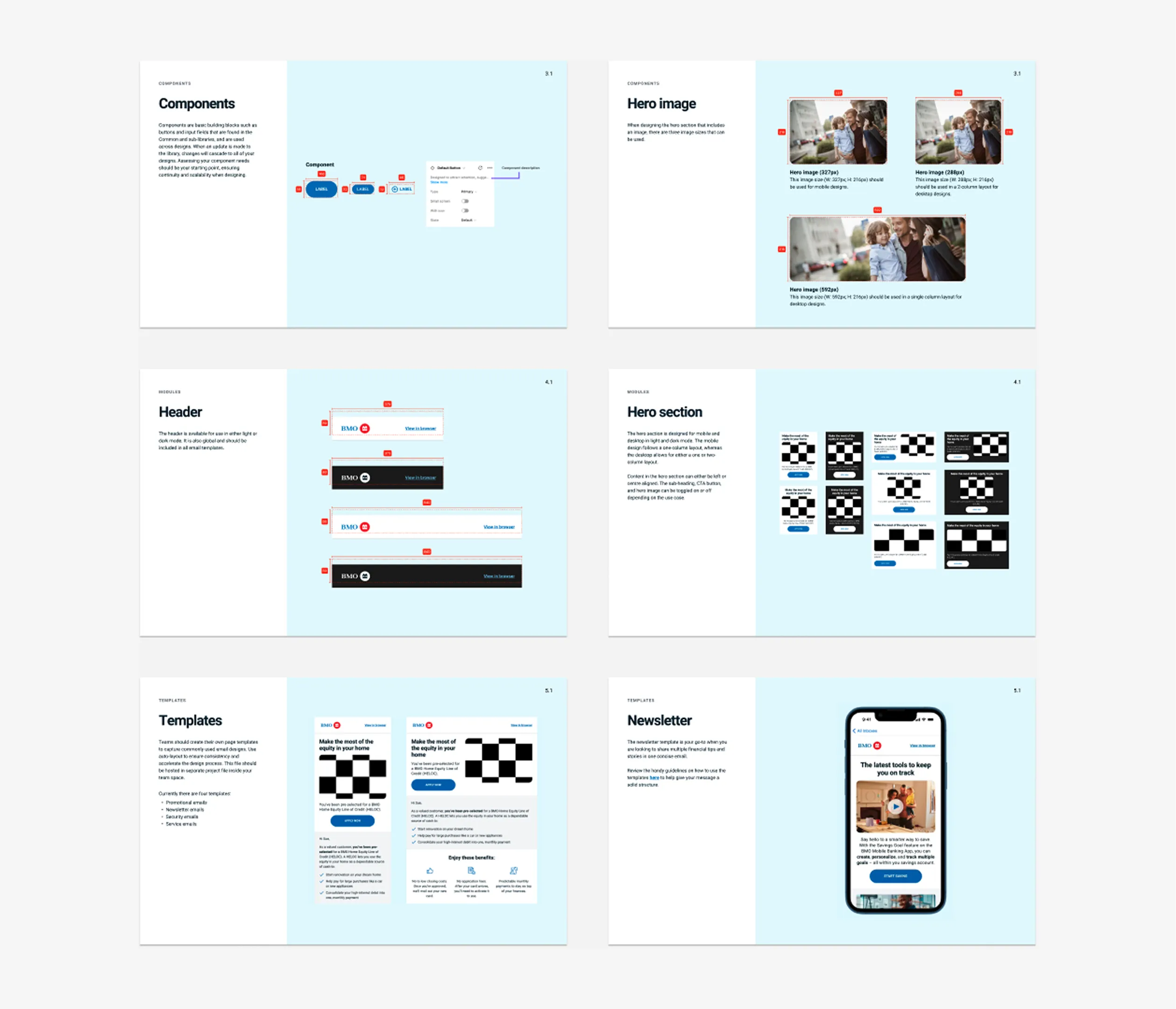
Clear documentation was created to support adoption across design, development, and marketing. The component library was organised with visuals, specs, and best practices. Usage guidelines gave teams step by step instructions for applying and adapting components. Accessibility standards covered contrast ratios, font sizing, and dark mode support. The goal was to make the system approachable enough that teams could move faster with less rework and more confidence.
08 Outcome and Impact
Measurable impact across the org
The system brought measurable improvements to both the subscriber experience and internal workflows. Standardised components and templates created a unified visual identity across all campaigns. The modular setup helped teams build emails faster and eliminate duplicated work. To support rollout, the system was presented at a department showcase, supported by Figma workshops, and launched as a public library across BMO. Production benchmarks were set and early data pointed to improved click-through rates driven by clearer, better positioned calls to action.
Want to see what a design system can do for your product?
Get in touch to discuss how ProdVent approaches scalable design from the ground up.
Work completed prior to ProdVent